
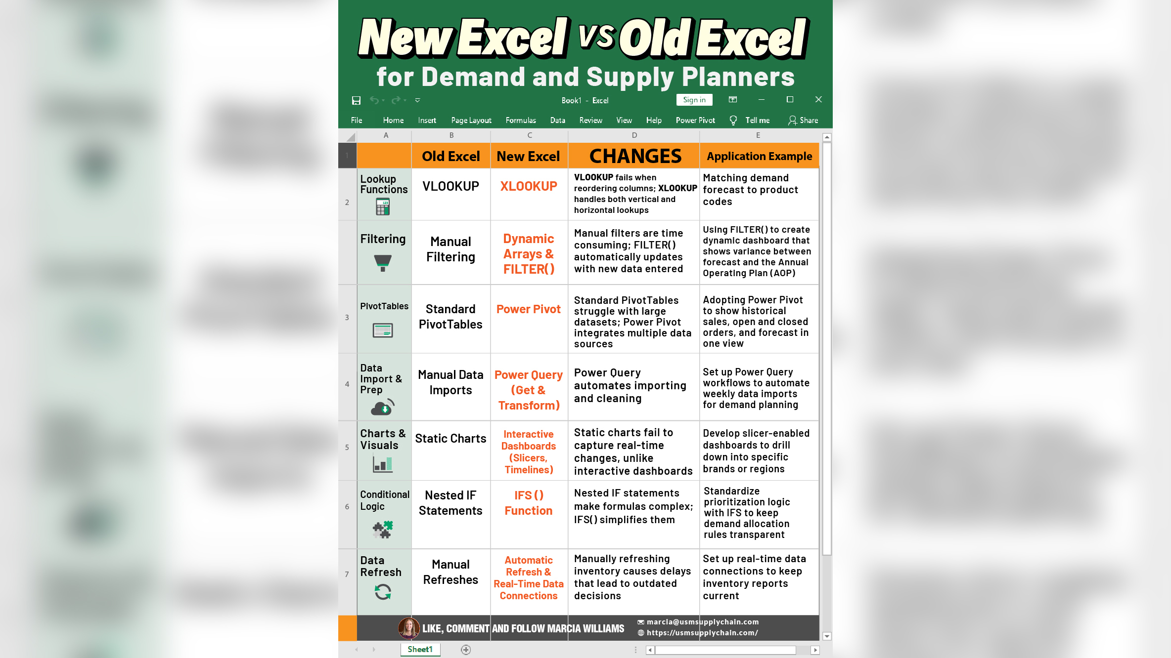
Excel is not dead. Okay, maybe the old Excel. Microsoft Excel has evolved and for demand and supply planners, this evolution translates into serious time savings, automation, and better decision-making. It can mean the difference between firefighting and forward planning.
Here’s a breakdown of 7 key Excel upgrades, what’s changed, and how you can apply them immediately in your role:
1. Lookup Functions: VLOOKUP → XLOOKUP
What Changed:
VLOOKUP fails when columns are rearranged and only looks to the right. XLOOKUP works left, right, vertically, and horizontally.
Practical Use Case:
Match your demand forecast SKUs to product master codes even if the columns are shuffled or data structure changes.
Feature Example:
=XLOOKUP(A2, ProductTable[SKU], ProductTable[Description], “Not Found”)
This will return the product description for the given SKU or display “Not Found” if the SKU doesn’t exist in the table.
The “Not found” helps avoid #N/A errors and makes your worksheet cleaner, especially when presenting to stakeholders.
2. Filtering: Manual Filtering → FILTER() & Dynamic Arrays
What Changed:
Manual filters are slow, static, and prone to human error. The FILTER() function dynamically updates based on changes in your data. No clicks required.
Practical Use Case:
Build a dashboard that automatically updates to show forecast variance by product or region as new data is added.
Feature Example:
=FILTER(ForecastTable, ForecastTable[Region]=”West”)
This formula will always return only the rows for the West region, even as new weeks or entries are added to the table.
3. PivotTables: Standard PivotTables → Power Pivot
What Changed:
Power Pivot connects to multiple data sources, handles large datasets efficiently, and supports relationships between tables.
It eliminates the need for manual data merging and enables advanced calculations using DAX (Data Analysis Expressions).
Practical Use Case:
Track open orders, historical sales, forecast and AOP (Annual Operating Plan) in one dashboard without copying and pasting across files or combining data manually.
Feature Example:
Total Sales := SUM(Sales[Amount])
This simple measure calculates total sales across your data model. You can then slice it by product, region, or time using PivotTables.
You can also create additional DAX measures like forecast variance or inventory turnover for deeper, automated analysis.
4. Data Import: Manual → Power Query (Get & Transform)
What Changed:
No more manual copy-paste. Power Query automates data import, cleaning, and transformation; saving hours and reducing errors.
Practical Use Case:
Set up weekly automatic imports of supplier inventory reports or POS data for replenishment planning without touching the source files.
Feature Example:
Use “Get Data → From Folder” to combine multiple Excel files into a single, refreshable dataset.
You can also apply transformations (e.g., remove columns, rename headers, filter rows) once; and reuse them every week with a single click.
5. Charts & Visuals: Static Charts → Interactive Dashboards
What Changed:
Static charts offer limited insight and require manual updates. Interactive dashboards with slicers and timelines allow real-time filtering and exploration without touching the underlying data.
Practical Use Case:
Visualize forecast accuracy by brand, region, or month to quickly spot trends, gaps, or areas needing attention.
Feature Example:
Add a timeline slicer to track how forecast bias or WMAPE has changed over time; enabling quick month-to-month comparisons with a single click.
6. Conditional Logic: Nested IF → IFS()
What Changed:
No more confusing IF jungle. IFS() makes multiple logical rules easier to read and manage.
Practical Use Case:
Set up inventory allocation rules that prioritize key accounts first, then secondary regions.
Feature Example:
=IFS(Customer=”Top”, “High”, Customer=”Standard”, “Medium”, TRUE, “Low”)
This keeps your logic clean, readable, and scalable; especially when dealing with many customer types or service levels.
7. Data Refresh: Manual → Automatic Refresh & Real-Time Connections
What Changed:
Manual refreshes delay visibility and increase the risk of acting on outdated data. Real-time connections ensure your dashboards are always up to date with zero manual effort.
Practical Use Case:
Connect inventory dashboards directly to your ERP or warehouse system so stock levels always reflect the latest data.
Feature Example:
Use Power BI + Excel dataflows to create live dashboards that auto-refresh and can be shared seamlessly with your cross-functional team.
Conclusion:
Today’s demand and supply planning requires agility, speed, and confidence in data.
These Excel upgrades, especially Power Query, XLOOKUP, and interactive dashboards are game-changers.
Start by replacing one old habit (like manual filtering) with a new one (like FILTER()) and gradually upgrade your entire workflow.
Excel can be more than a spreadsheet.
It can be your planning superpower.


